Marketplace Comparisons
Comparing a scanned product against retailer alternatives, with price, package size, health context, and clearly labeled development data.
Features built this month
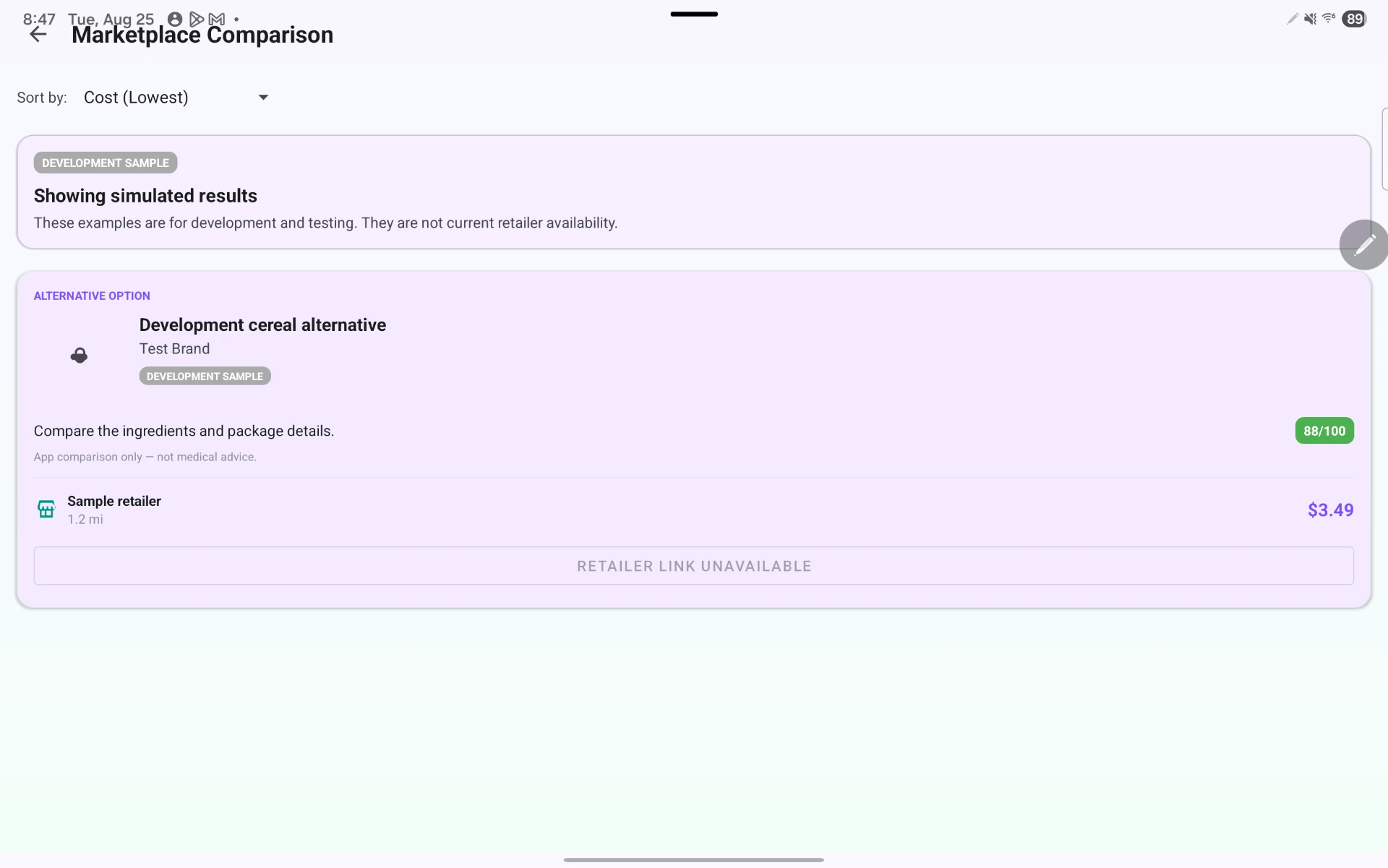
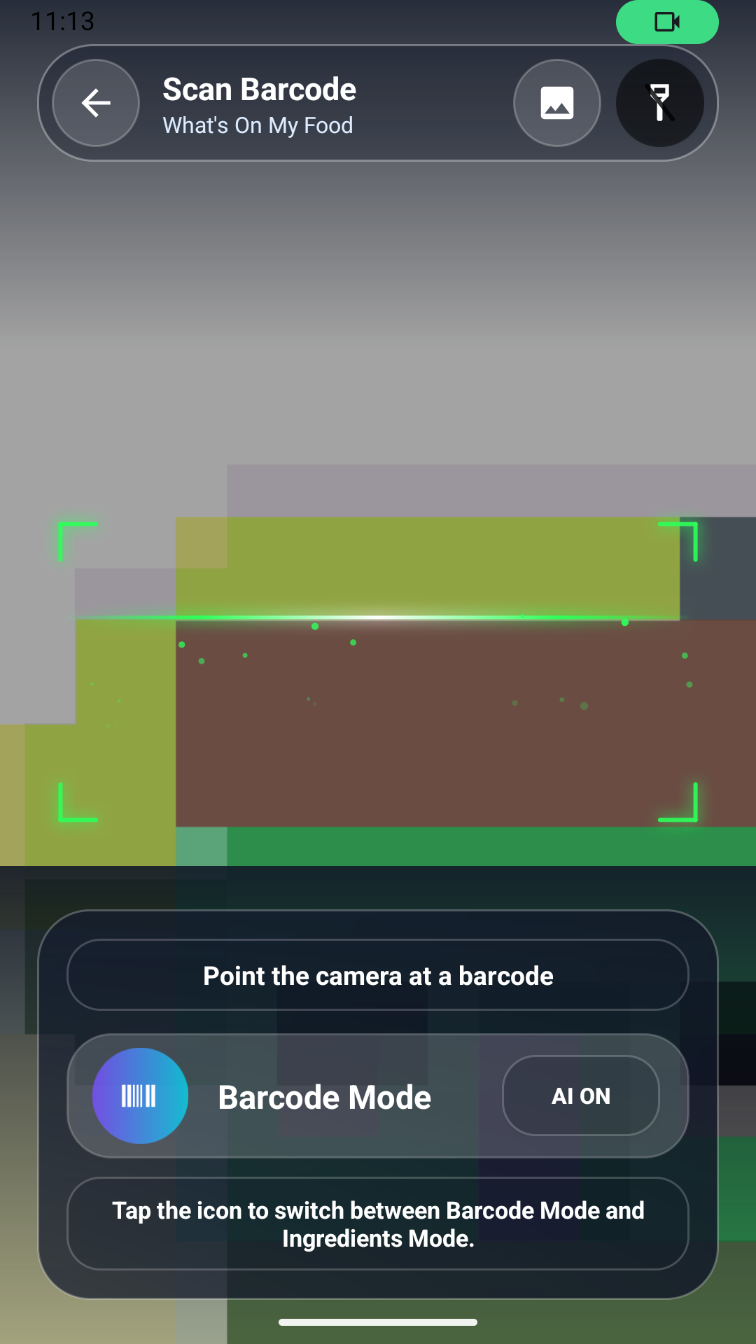
Milestone 5 introduced the marketplace comparison workflow. From the product details screen a user selects “Compare alternatives,” and the app forwards the product’s barcode, name, brand, and category to the marketplace layer, so nothing has to be rescanned.
I built the comparison request as a Retrofit call into the backend, which normalizes retailer payloads into a single alternative-product model before they reach the UI. Each alternative card renders the product name and image, retailer, price and unit price, package size, health information, and a short explanation of why the alternative may help. Sorting runs client-side on cost and health score so the list stays responsive on older devices.
The harder half of the work was state coverage. The marketplace has distinct screens for loading, live results, development samples, no results, timeouts, and service errors, and development data carries an explicit DEVELOPMENT SAMPLE label so it is never mistaken for live retailer availability. I also added a guard that blocks navigation into the marketplace when a product lacks the fields needed for a meaningful comparison.
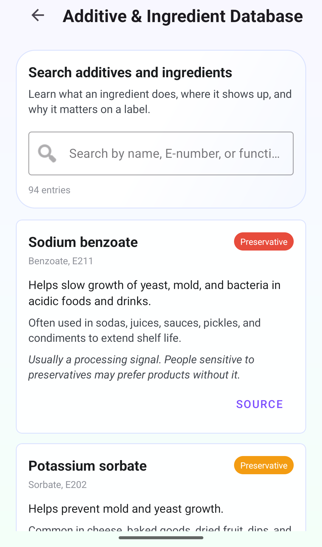
Tools and resources: Android Studio, Jetpack Compose, Retrofit + OkHttp, Room for cached results, and the Open Food Facts category taxonomy for mapping products to comparable alternatives.
Challenges
Retailer data is inconsistent — missing package sizes, mixed units, and prices that do not divide cleanly into a unit price. I ended up writing a small normalization pass so unit-price comparisons are apples-to-apples instead of silently misleading.
Deciding how visible “development sample” data should be also took several passes. Too subtle and it misinforms; too loud and the screen looks broken. The labeled badge on each card was the compromise.
Retrospective
What went right: designing every marketplace state up front meant the screen never showed a blank or half-loaded list, and passing scan context forward removed an obvious point of user friction.
What went wrong: I underestimated retailer data cleanup and spent more time on normalization than on the comparison UI itself. A couple of error states were only caught during manual testing rather than by design.
How I will improve: I am adding instrumented test coverage for each marketplace state so state regressions surface automatically instead of during hand testing.